Most small business websites do one of two things wrong. They either try to say everything at once, or they look polished but give people no clear next step. That is usually the gap between a site that gets admired and a site that gets calls. If you want to know how to design a small business website that converts, start here: make it easy for the right customer to understand what you do, trust you fast, and take action without hunting for it.
For a service business, conversion is not abstract. It is a phone call, a quote request, a contact form, or a booked job. Good website design supports those actions. It does not get in their way.
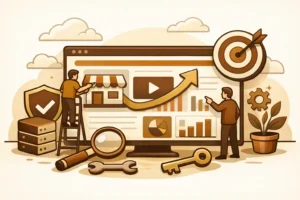
How to design a small business website that converts
A high-converting website is less about decoration and more about decision-making. Your visitor lands on the page with a question in mind: Can this business solve my problem, and can I trust them enough to reach out? Every section of the site should help answer that question quickly.
That means your design choices need to support clarity before creativity. Strong typography matters. Good photos matter. Clean branding matters. But if your homepage headline is vague, your navigation is cluttered, or your call-to-action is buried, the visual polish will not save the result.
This is especially true for local service businesses. A homeowner with a leaking pipe or a broken AC unit is not looking for a brand experience. They are looking for a credible company that seems competent, responsive, and easy to contact.
Start with one clear offer
The fastest way to weaken conversions is to make people figure out what you actually do. Your homepage should lead with a plain-English headline that says what the business offers and who it serves. If a plumber, roofer, electrician, or restoration company lands a visitor on the site, that visitor should not need to scroll to understand the basics.
A strong headline is specific. It avoids clever wording and empty claims. “Reliable Plumbing Repair for Omaha Homeowners” will outperform something broad like “Solutions You Can Trust” almost every time.
Under that headline, add a short supporting line that answers the obvious next questions. What kind of work do you handle? What area do you serve? What should the customer do next? This is not the place for a long company story. It is the place for direction.
Put your call-to-action where people can see it
A converting website does not whisper the next step. It makes it obvious. If you want phone calls, show the phone number prominently in the header and on mobile. If you want quote requests, use a visible button with direct language like “Request a Quote” or “Book an Estimate.”
This sounds simple, but many small business sites still hide the main call-to-action under vague labels like “Learn More” or force users through too many clicks. That creates friction, and friction costs leads.
It also helps to repeat the call-to-action throughout the page. Not every visitor is ready at the same moment. Some will convert from the hero section. Others need to see services, reviews, or proof of work first. Give them multiple chances.
Build for mobile first, not mobile later
If most of your traffic comes from phones, your website should be designed for the phone experience first. That means fast loading, tap-friendly buttons, short sections, and contact options that are easy to use with one thumb.
A desktop layout that gets squeezed onto a small screen is not mobile design. It is compromise. On a service website, the mobile version is often the real version because that is where the customer makes the decision.
Pay attention to what shows up first. On mobile, your headline, contact button, and proof points need to appear quickly. Long intros, oversized banners, and stacked filler sections push action too far down the page.
Speed matters here too. A slow site makes a bad first impression and drops conversion rates. Large image files, bloated plugins, and fancy motion effects may look impressive in a pitch, but they often work against actual business results.
Keep navigation tight
Most small business sites do not need a complex menu. In many cases, Home, Services, About, Service Area, Reviews, and Contact are enough. The more choices you add, the more chances people have to drift.
Good navigation helps visitors orient themselves without thinking too hard. It should match how real customers search for information, not how the business organizes itself internally. If you offer five distinct services, make those easy to find. If one service drives most of your revenue, give it prime placement.
There is a trade-off here. A broader menu can help SEO and give users more detail. But too much structure can overwhelm people, especially on mobile. The right balance depends on how many services you offer and how different they are from each other.
Use trust signals early
People do not convert because your site is pretty. They convert because it feels credible.
That credibility comes from visible trust signals. Reviews, testimonials, certifications, years in business, before-and-after photos, service guarantees, and real project images all help reduce doubt. If you have them, use them high on the page, not buried at the bottom.
For local businesses, location-specific trust matters too. A simple line about the areas you serve can reassure visitors that they are in the right place. The same goes for mentioning licensing, insurance, or emergency availability if those are meaningful buying factors in your field.
Stock imagery is another conversion issue. Generic smiling models in hard hats rarely help. Real team photos, trucks, job sites, and completed work usually perform better because they feel grounded. They show there is a real operation behind the logo.
Service pages should do sales work
A lot of small business websites treat service pages like placeholders. They list a service name, add a short paragraph, and call it done. That wastes a major conversion opportunity.
Each service page should answer the questions a prospect is already asking. What is included? Who is it for? What problems do you solve? What happens next if they contact you? If pricing cannot be fixed, explain the quoting process instead. Clarity still helps.
This is also where design and copy need to work together. Break content into readable sections. Use useful subheads. Add photos or supporting proof where it fits. Then place a call-to-action that matches the page intent. Someone reading about water damage restoration should not need to search for how to request help.
Reduce friction in your forms
If your contact form asks for too much, fewer people will fill it out. That does not mean forms should be careless. It means they should only ask for information the business actually needs at the first step.
For most service businesses, name, contact info, service needed, and a short message are enough. You can gather the rest during the follow-up call. Every extra field is a small tax on conversion.
It also helps to set expectations near the form. Tell people what happens after they submit it. Will you call the same day? Will they get an emailed estimate request confirmation? That kind of clarity lowers hesitation.
Design for intent, not vanity
A site can look modern and still underperform. That happens when the design decisions are driven by taste instead of customer behavior.
For example, full-screen video backgrounds may look high-end, but they can slow down the page and distract from the offer. A minimal layout may feel clean, but if it strips out helpful context or trust signals, it can weaken response. The right design is the one that helps the visitor decide.
This is where discipline matters. Every page element should earn its place. If a section does not support clarity, trust, or action, it is probably decoration.
What actually moves conversion rates
If you are wondering how to design a small business website that converts, the answer usually comes down to a handful of practical improvements made consistently. Clear headlines outperform vague branding. Strong calls-to-action beat passive buttons. Mobile-first layouts beat desktop leftovers. Proof beats promises.
The businesses that get more from their websites are not always the ones with the biggest budgets. They are often the ones that keep the site focused, fast, and easy to use. No drama. No maze of pages. Just a clear path from visit to inquiry.
That is also why packaged, conversion-focused builds tend to work well for small operators. A disciplined process forces the important choices early – what the offer is, what pages matter, what action the site should drive, and what can wait until later.
If your current website feels busy but underperforms, the fix is probably not more design. It is better structure, sharper messaging, and fewer obstacles between interest and contact. Build for the customer in a hurry, and you will usually build a better website for everyone else too.
A good small business website does not need to win awards. It needs to win the next call.