A lot of small business websites fail in the first five seconds. Not because the company is bad at what it does, but because the site is slow, cluttered, or vague. The best small business website design is not the one with the flashiest layout. It is the one that makes a busy customer think, These people look legit. I know what they do. I know what to do next.
If you run a service business, that standard matters more than design awards ever will. Your website has a job. It needs to answer questions, build trust, and create action – calls, form fills, quote requests, and booked work. Everything else is secondary.
What best small business website design actually means
For most small businesses, good design is not about novelty. It is about removing hesitation. A homeowner looking for an electrician, plumber, roofer, or HVAC company is not browsing for entertainment. They are trying to solve a problem, often on their phone, often in a hurry.
That changes what “best” means.
The best small business website design is clear before it is clever. It loads fast. It works on mobile without pinching and zooming. It tells people what you do, where you work, and how to contact you without making them hunt. It uses strong headlines, real service pages, and a layout that guides people toward the next step.
A polished look still matters. People do judge a business by its website. But credibility comes from structure as much as style. Clean spacing, readable text, consistent branding, and obvious calls to action usually outperform trendy effects and overbuilt animations.
The traits that separate a lead-generating site from a pretty one
A website can look modern and still underperform. That is the trap a lot of owners fall into. They focus on appearance, then realize later the site does not bring in enough calls.
The strongest sites usually get a few fundamentals right.
First, they lead with a clear value proposition. When someone lands on the homepage, they should know what you do, who you do it for, and what action to take next. If your headline says something vague about quality and excellence, it is probably wasting space.
Second, they make trust easy to verify. That can come from testimonials, project photos, certifications, service area details, before-and-after examples, or clear business information. People want proof that you are established and competent. Especially in local service work, trust is not a bonus feature. It is the sale.
Third, they respect mobile users. Most small business traffic now comes from phones. If your site buries the phone number, stacks content awkwardly, or forces visitors through a clumsy contact form, you are losing leads before the conversation starts.
Fourth, they keep friction low. Fewer decisions. Fewer distractions. Fewer walls of text. A visitor should not need a tour guide to find your services, pricing approach, or contact options.
Best small business website design for service businesses
Service businesses have a different set of needs than ecommerce stores or media brands. A landscaping company does not need the same user flow as an online clothing shop. A law firm does not need the same homepage as a restaurant.
For most local operators, the core pages are straightforward: home, about, services, service area if relevant, and contact. Add project galleries, FAQs, or location pages when they support search visibility and sales. Skip them when they are just filler.
This is where a lot of small businesses overcomplicate the build. They assume more pages automatically means better marketing. Sometimes it does. Often it just creates extra copy, extra review cycles, and extra delay.
A better approach is to build around buyer intent. What are people actually trying to find? Usually it is a service, a location, proof, and a way to reach you. Start there. Then expand only if there is a clear business case.
For example, an HVAC company may benefit from separate pages for AC repair, furnace installation, and maintenance plans because those services map to different searches and different customer needs. A solo consultant with one core offer may not need that level of segmentation at all.
What to prioritize if budget and time are limited
Most small business owners are not choosing between a perfect website and an average one. They are choosing between launching something effective now or spending months in circles chasing extras they may not need.
If budget and time matter, prioritize the pieces that move the needle fastest.
Get the messaging right. A clear homepage headline and strong service descriptions are worth more than decorative flourishes. Make sure the site is mobile-first. Keep navigation simple. Use real photos if you have them. Put your main call to action in obvious places. Make the contact process easy.
You can always add more later. You can expand SEO content, build out additional service pages, refine visuals, or layer in advanced lead features after the foundation is in place. What hurts most small businesses is not launching too small. It is launching too late, or launching with a site that looks fine but says very little.
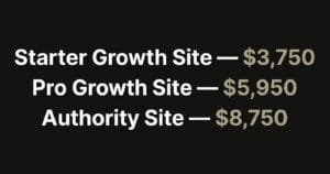
That is one reason package-based website builds make sense for many operators. Defined scope, fixed timelines, and a proven framework usually beat open-ended agency engagements when the goal is to get a solid lead-generation site live without the drama.
Design choices that help conversion
Good conversion design is usually subtle. It does not shout. It guides.
Strong hierarchy matters. Your most important message should be the easiest thing to see. Calls to action should stand out without looking desperate. Contact buttons should be visible early and often, especially on mobile.
Page layout matters too. Break content into clear sections. Use headlines that sound like a human talking, not corporate filler. Keep paragraphs readable. If every section looks equally important, nothing is.
Images can help or hurt. Real team photos, trucks, job sites, or finished work usually build more trust than generic stock images. Stock photos are not always wrong, but they tend to flatten credibility if overused.
Then there is speed. Owners sometimes treat speed like a technical footnote. It is not. Slow websites lose attention, hurt conversions, and can drag down search performance. Heavy sliders, oversized video backgrounds, and too many plugins often create more problems than value.
Common mistakes small businesses should avoid
The biggest mistake is trying to please everyone. A website that speaks to everyone usually persuades no one. Be specific about your services, your market, and the type of customer you want.
Another common mistake is hiding the point. If a visitor has to scroll halfway down the page to figure out what you do, your design is not helping. Fancy motion effects will not fix weak positioning.
There is also a tendency to overload the homepage. Owners want to include every service, every credential, every idea, and every selling point all at once. The result is usually clutter. Better to organize information well and let the homepage direct traffic where it needs to go.
Finally, do not treat launch as the finish line. Even the best small business website design improves with real-world data. After launch, pay attention to what people click, what pages they visit, and where leads actually come from. Sometimes a simple headline change or call-to-action adjustment can improve results more than a full redesign.
How to judge whether a website is actually good
Ask plain questions.
Can a first-time visitor tell what the business does in seconds? Does the site feel trustworthy on a phone? Are service pages clear and specific? Is there an obvious next step? Does the site feel current without being overdesigned? Can a customer contact the business without friction?
If the answer to those questions is yes, you are probably looking at a strong site. If the answer is no, it does not matter how modern the fonts are.
This is also where experience matters. A senior-led process tends to produce better outcomes because someone is making practical decisions about scope, messaging, and conversion instead of dragging a small business through endless meetings and revisions. Browncoat Digital leans hard into that approach for a reason. Busy owners usually need clarity and momentum more than a grand creative exercise.
A good website should make your business easier to buy from. That is the standard. Not more complicated. Not more expensive than it needs to be. Just clear, credible, and built to pull its weight.
If you are deciding what kind of site to build next, keep your eye on what your customers need in the moment they land on the page. Meet that need fast, make trust easy, and give them a clear next step. That is where good design starts paying rent.